BATTLE PASS – UI PEEPS CHALLENGE
Moodboards Wireframes Hi-Fi Mockups Prototype
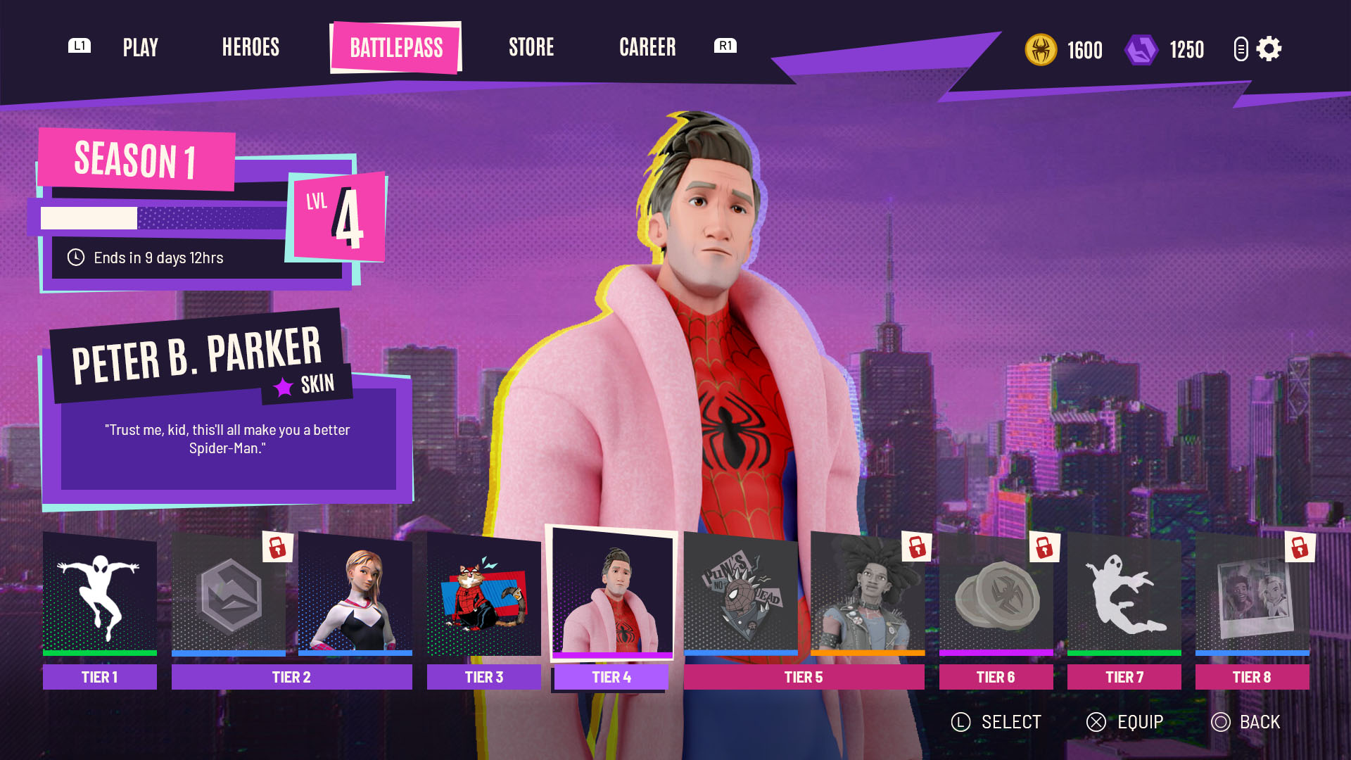
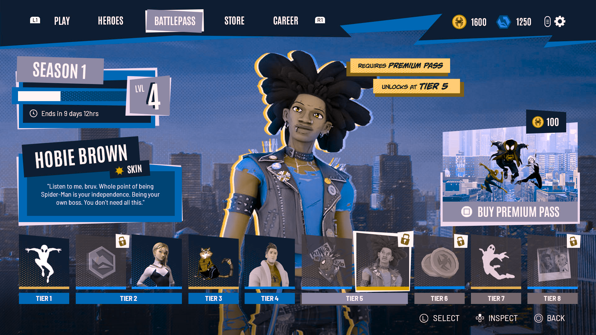
The first UI Peeps Challenge of 2025 saw me tackle a Battle Pass screen, based on the following brief:
Develop a Battle Pass UI for a multiplayer superhero game. Join forces with other players around the world to battle against powerful threats and keep your city safe. Every season of the battle pass brings new challenges, exclusive cosmetics, and powerful abilities and gear. Defeat enemies, earn rewards, and rise through the ranks to enhance your hero and give you the edge in every fight.
Moodboards
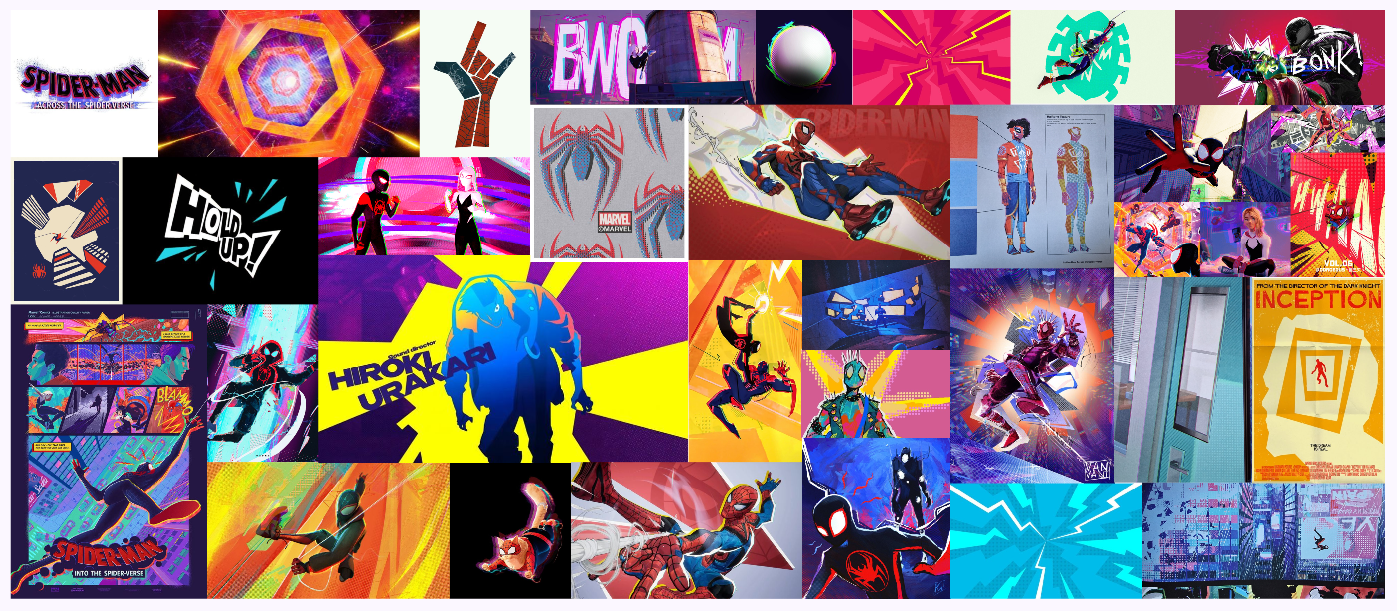
This challenge coincided with my first time playing Marvel Rivals, so I was already very much in the superhero multiplayer mindset! I decided to base my Battle Pass UI on the Spider-Verse Saga. I absolutely love the films and the art direction, and felt like they would lend themselves well to an action-packed multiplayer video game.
After compiling some moodboards I was able to quickly identify some key elements that would translate well into my battle pass UI. I was particularly drawn to the use of contrasting colours, exaggerated angular shape language, and comic-book textures. Even without any animation, the artwork still conveys a sense of action and excitement.
Art Moodboard
Wireframes
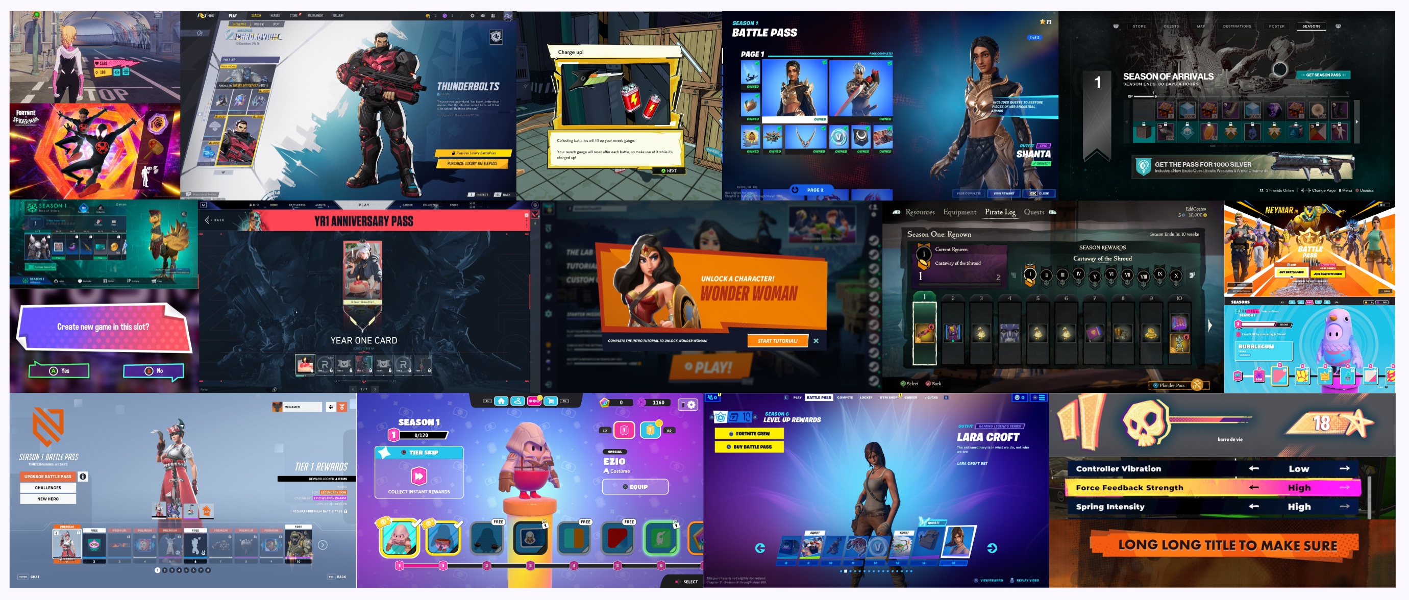
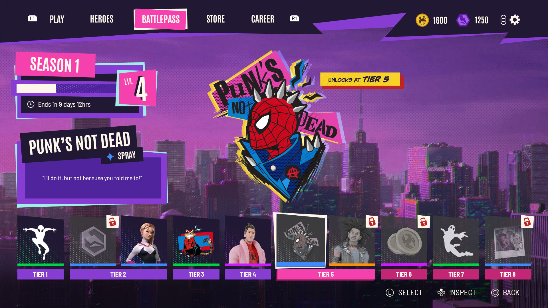
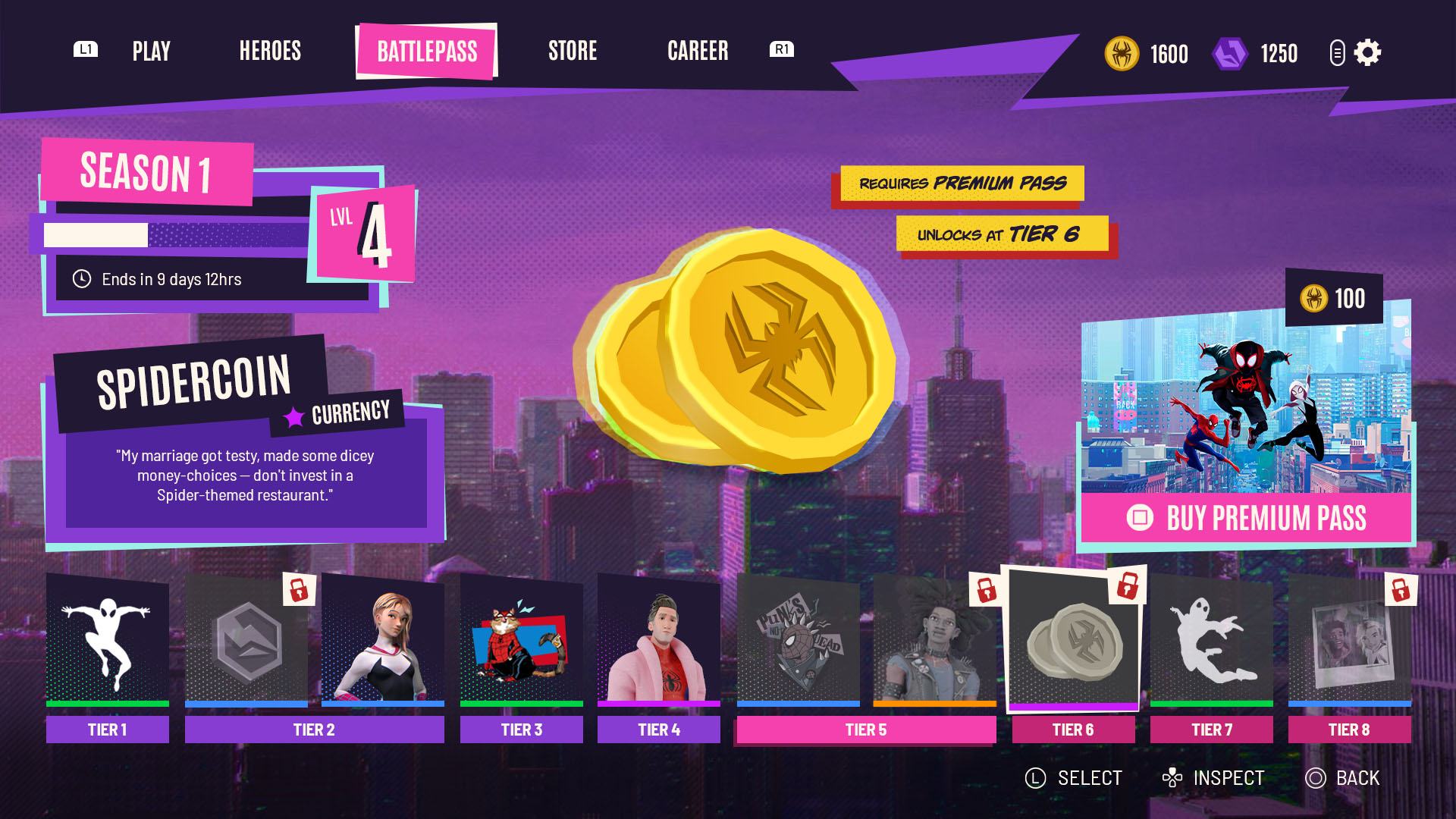
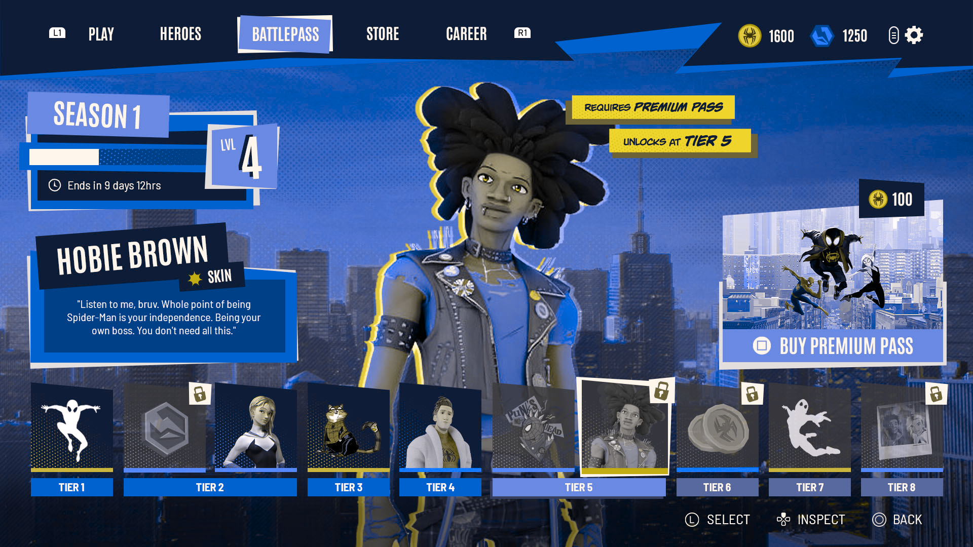
After researching other Battle Pass UI I decided to focus on a single-track design, combining free and premium rewards into a single row that is easy to understand at a glance. This would also allow me more screen space to show off the rewards in an exciting way and give players easy access to the Premium Pass purchase.
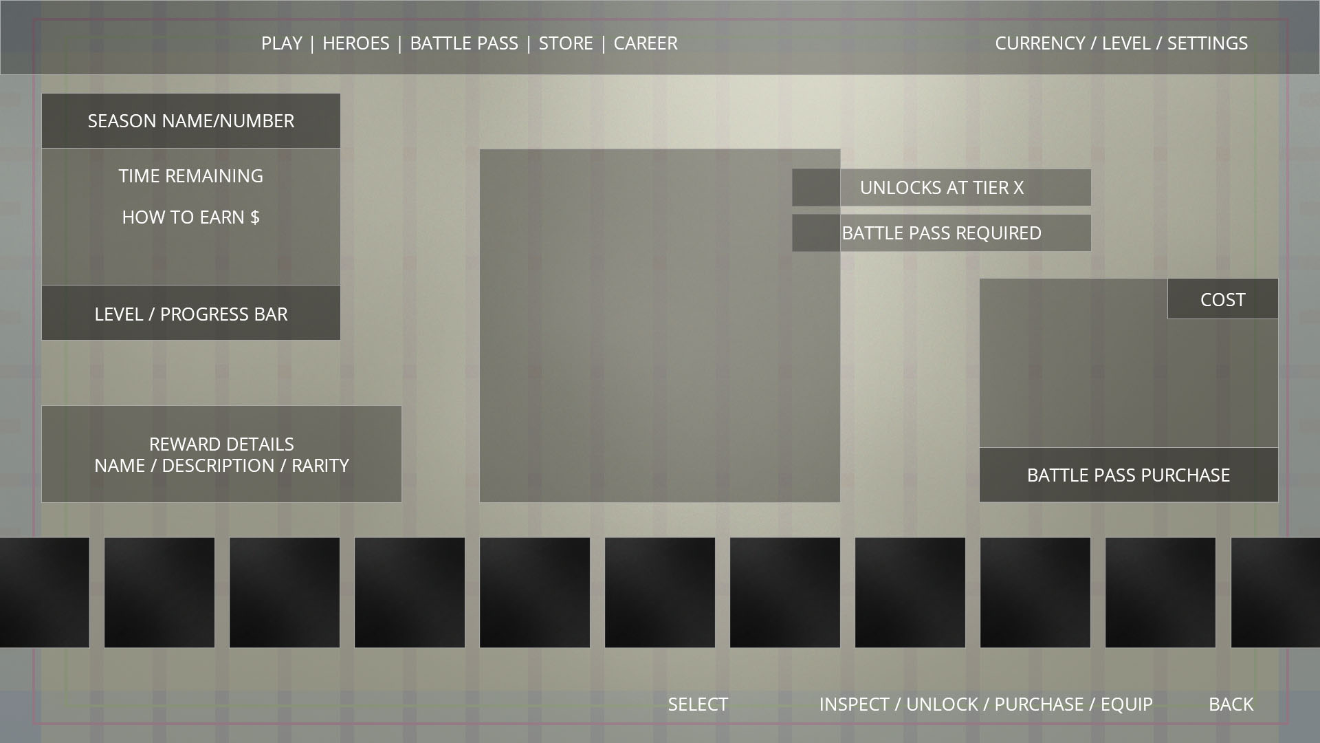
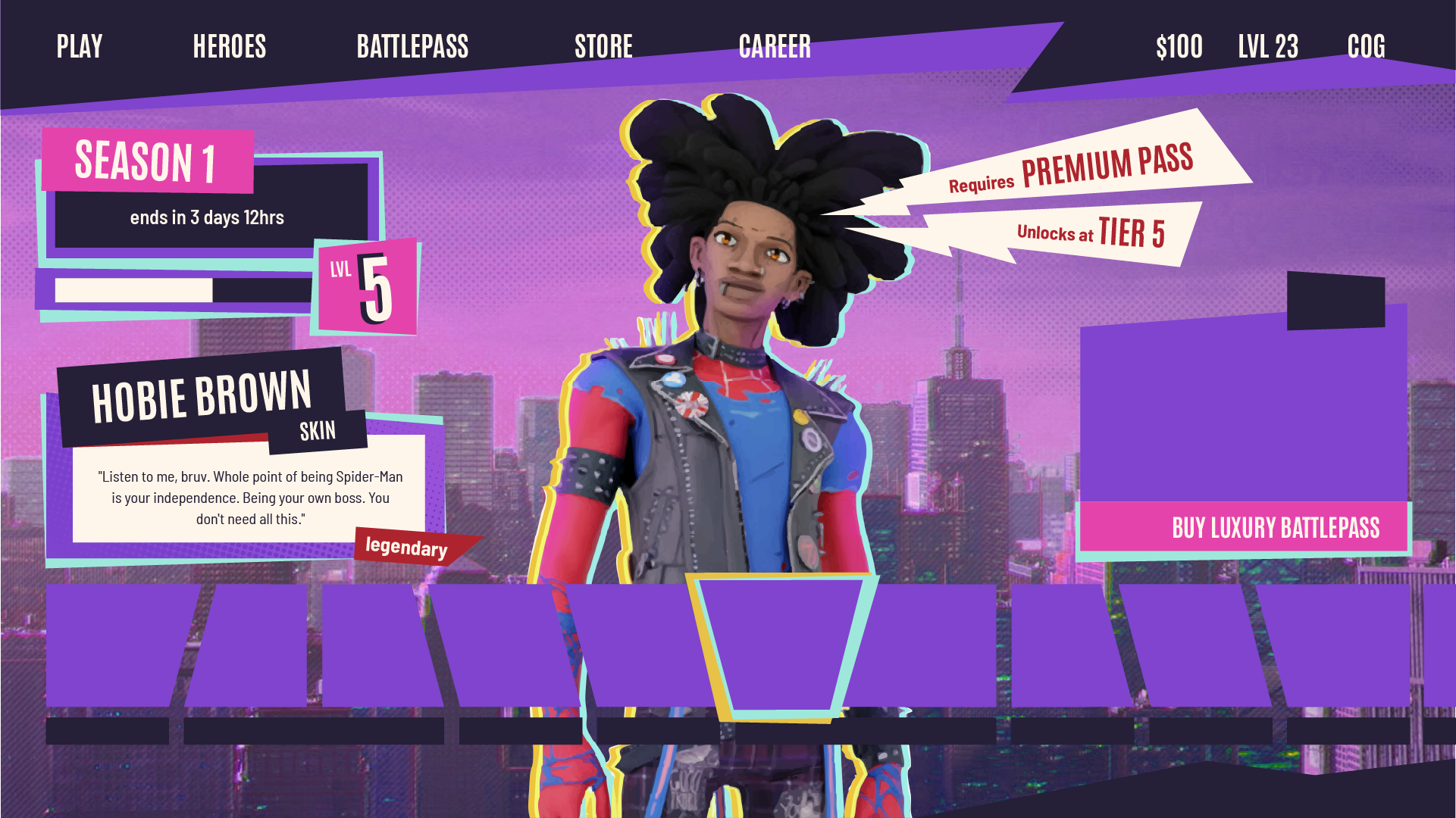
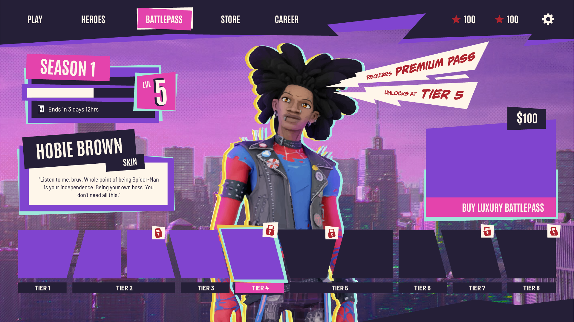
I created a simple lo-fi wireframe to test my layout, iterating upon it several times before I felt ready to move to prototyping.
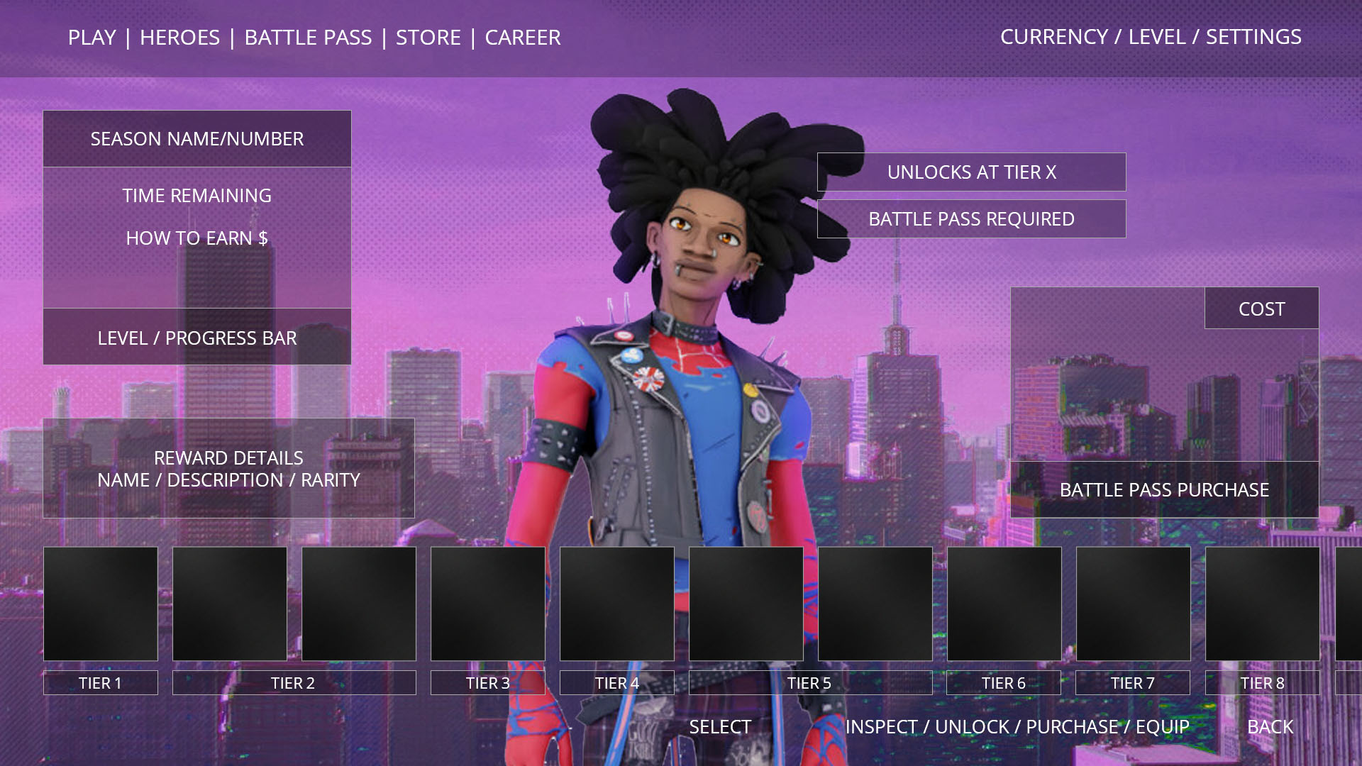
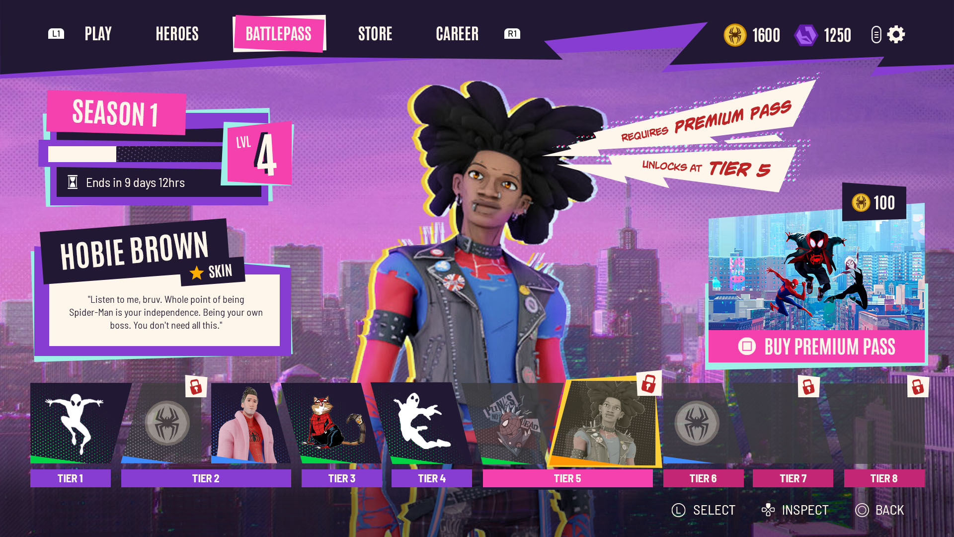
After blocking out the overall structure of the screen, I explored how I could bring the art style into the UI elements. At first I wanted to reference the comic-book style of the source material as much as possible. I designed the reward track to mimic a comic strip, and included a lot of exaggerated shapes to signpost important information and highlight states.
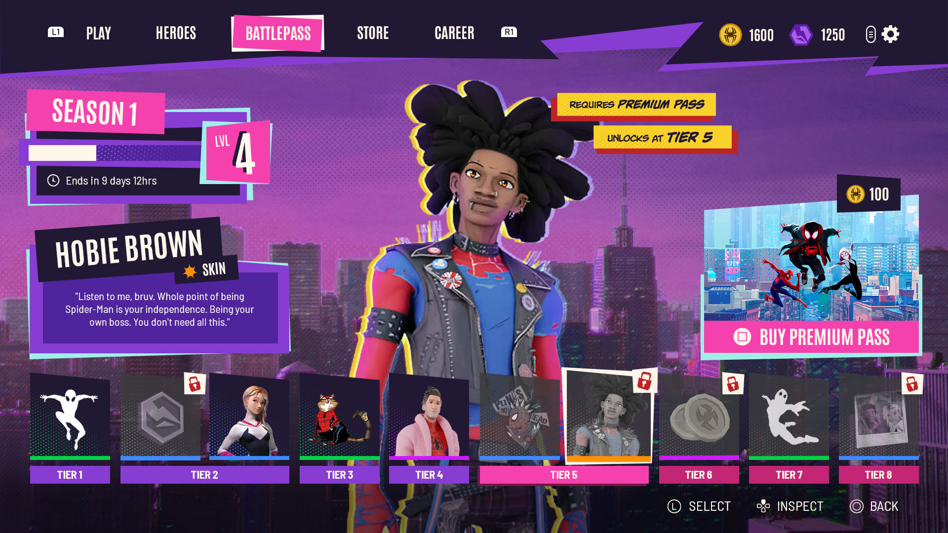
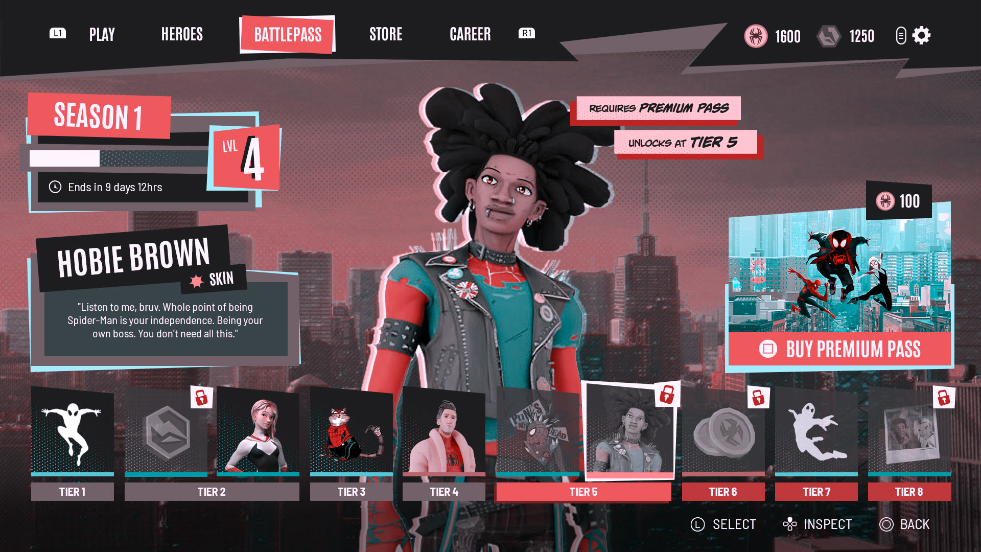
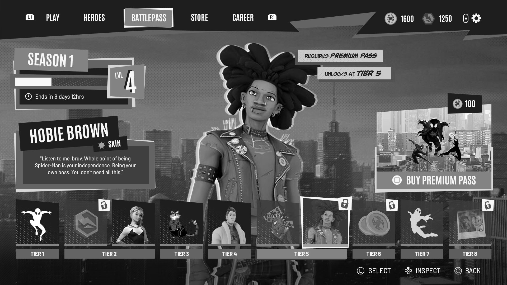
Ultimately though I decided that this was overkill. The UI had become chaotic and too distracting, so I simplified the reward track and tweaked the design of some other elements. I also refined the use of the colour palette, ensuring that the brighter colours were used more sparingly to emphasise more important information.
Prototype
When simplifying the UI earlier in the development process, I was eager to ensure that the design would still have the intended sense of action and excitement that I was aiming for. With this in mind I decided to explore how this could be achieved through animation and VFX.
Credits:
- Spider-Verse Saga is copyright Sony Pictures based on the characters created by Marvel Comics
- Background, Premium Pass, and polaroid image stills copyright Sony Pictures
- Gwen Stacey model provided by Clement Neca
- Hobie and Peter B Parker models provided by Random Things
- Spider-Cat artwork based on art by Kristafer Anka

